

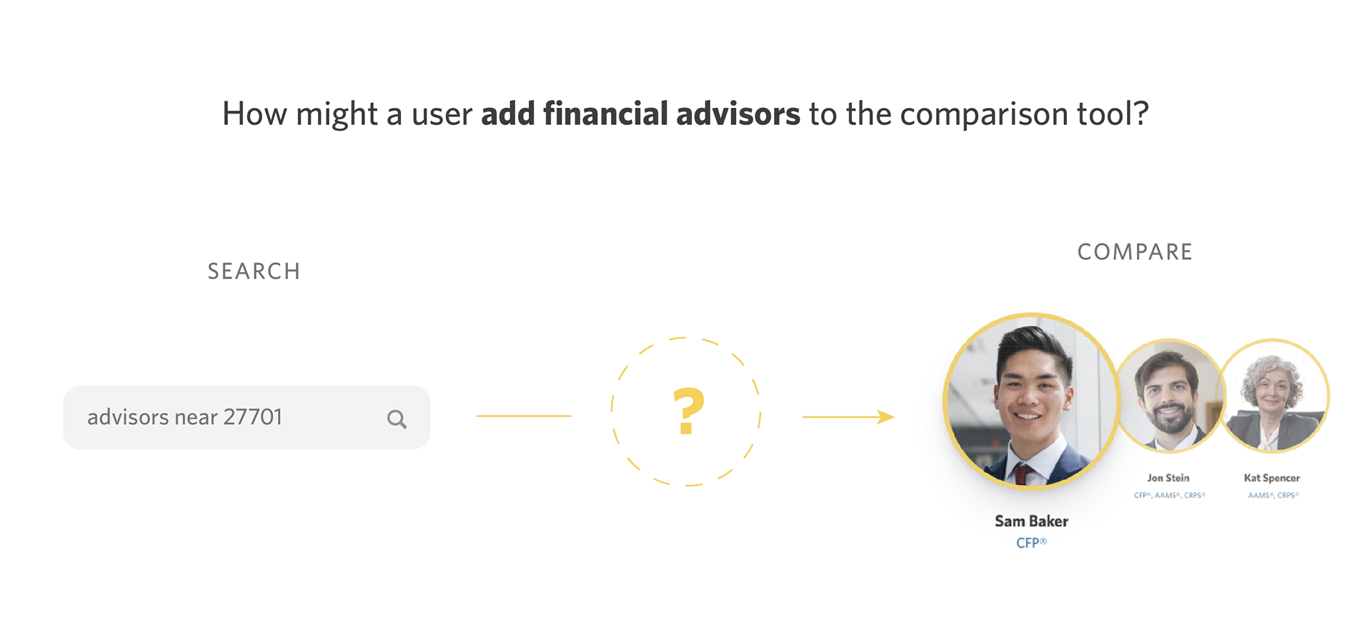
Objective
Edward Jones is launching a tool where users can compare financial advisors side-by-side. I was tasked with creating an entry point to this tool, which would come from the search flow. My goal was to bridge the gap between the search page and the results of the comparison tool.
Research
Interviews were conducted to see how users expect to use the search and compare functions of the Edward Jones website.
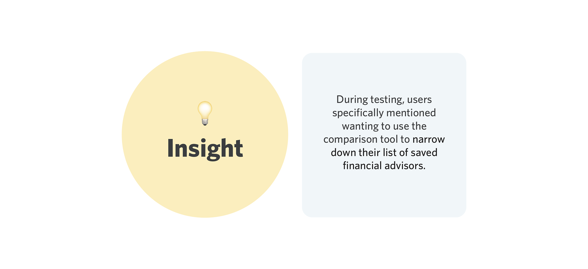
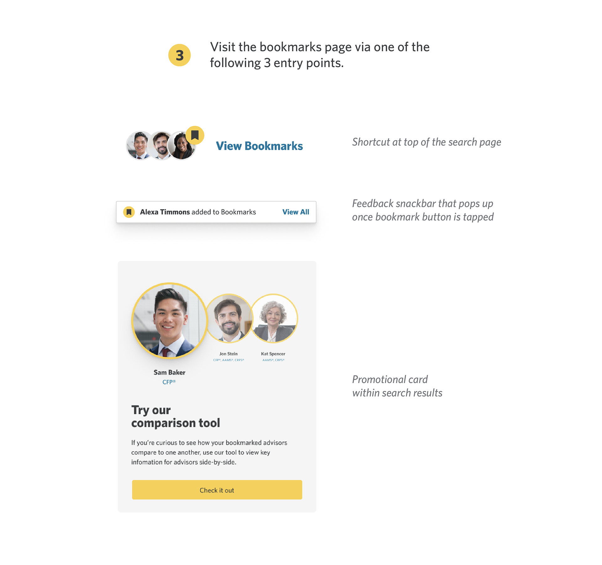
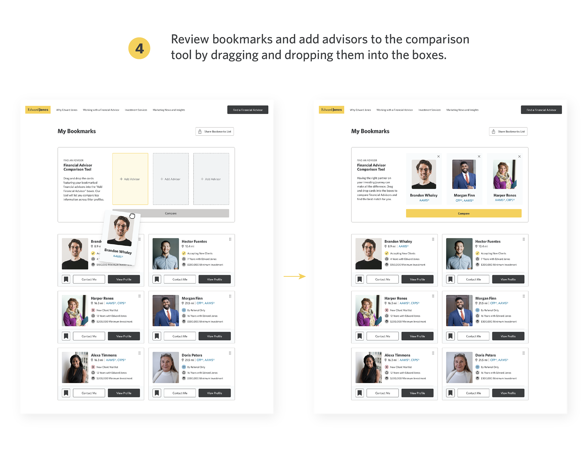
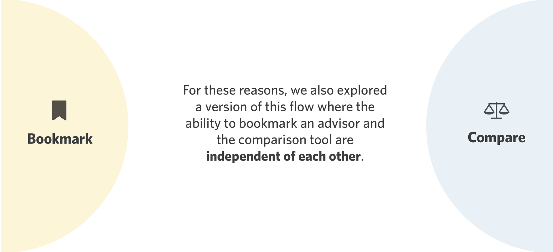
So, we identified that one pathway to the comparison tool can be via bookmarks.

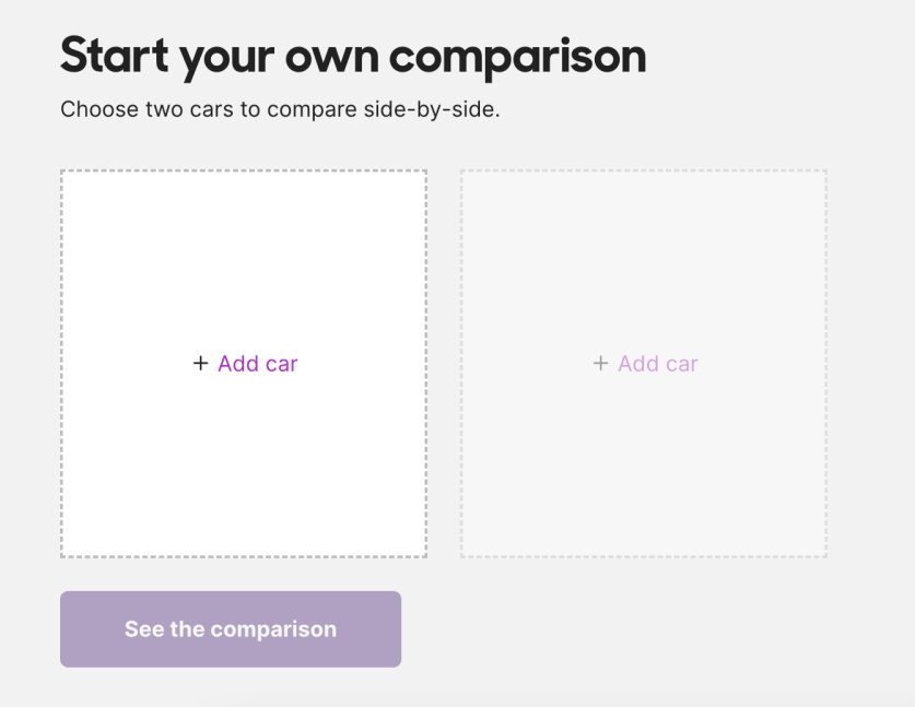
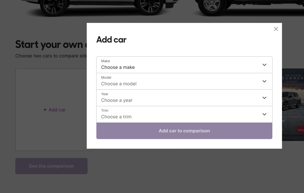
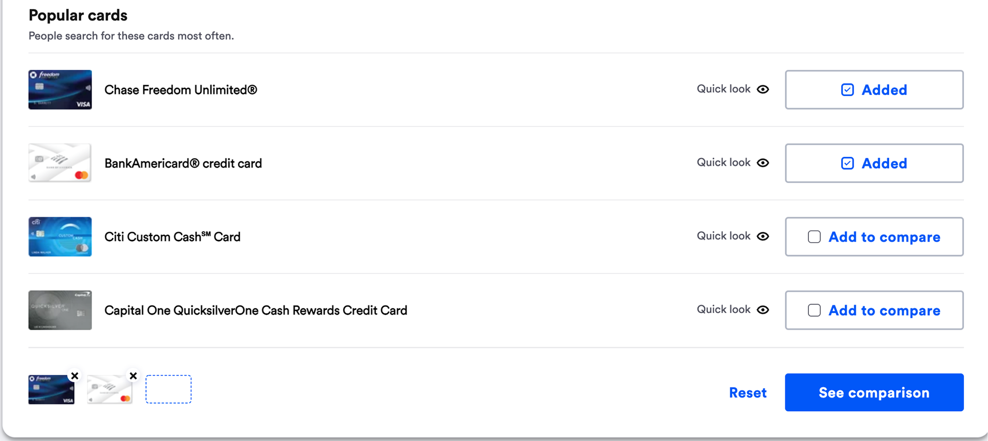
I then got to work exploring comparison tools that already exist as somewhat of a competitive analysis. Following my inspiration hunt, I laid out the plan for the user journey and sketched out some low-fidelity wireframes.

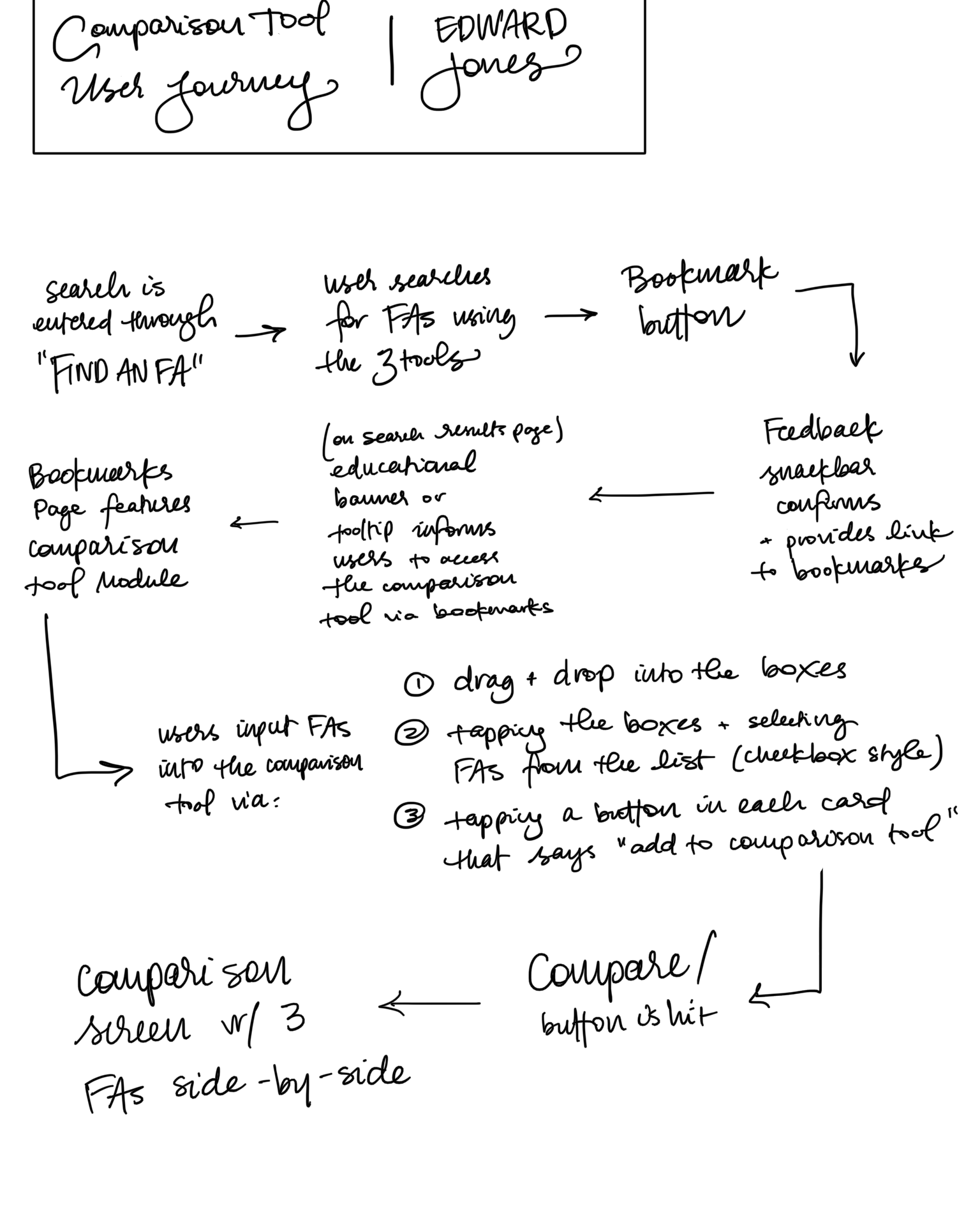

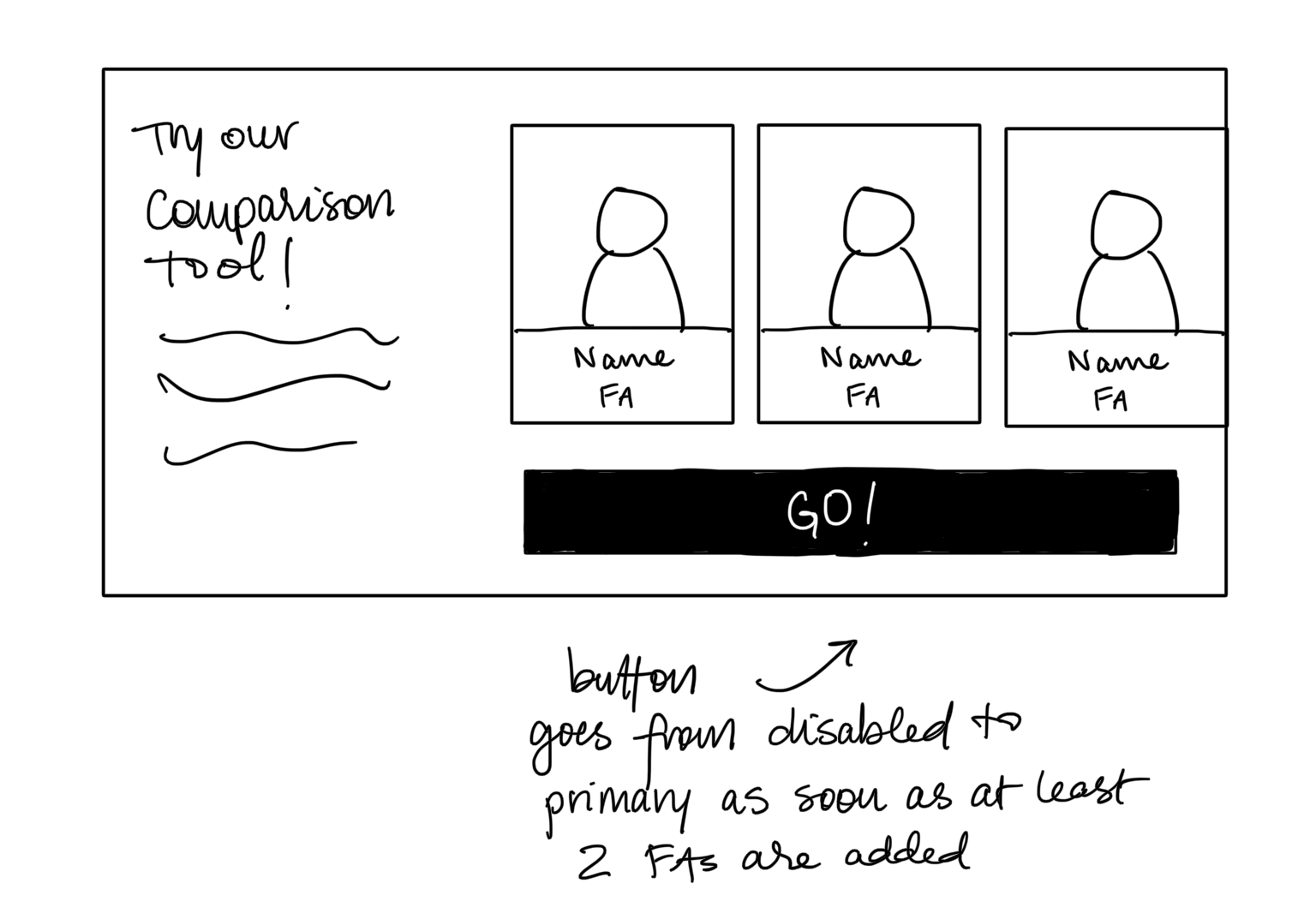
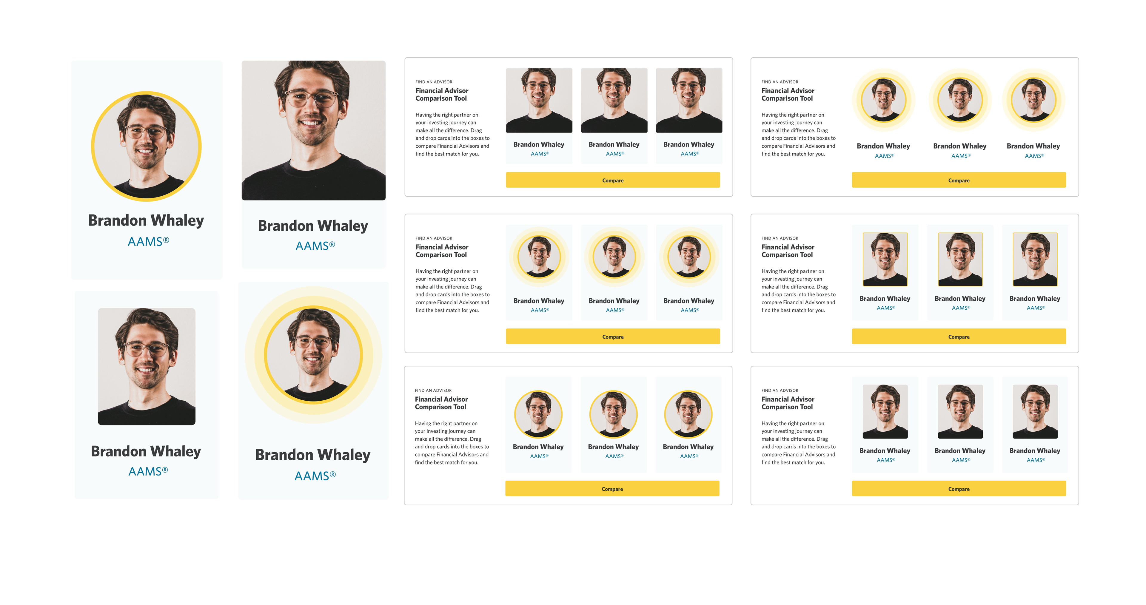
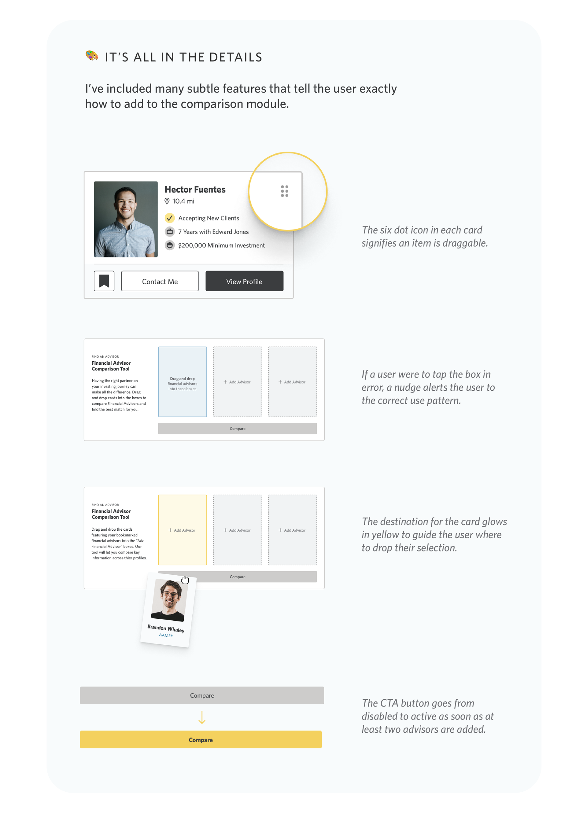
Once the plan was in place, I built out the components of the wireframe, like the advisor card, which went through many design iterations.
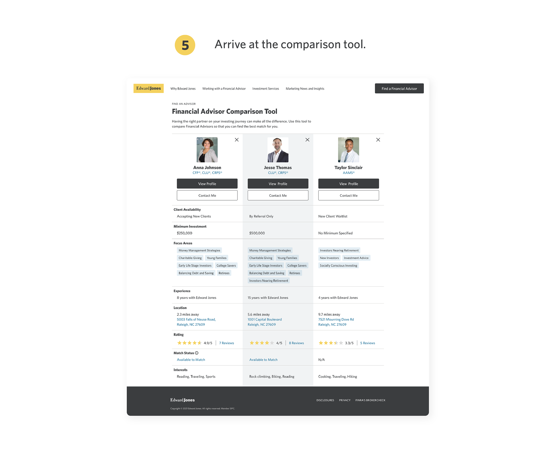
Solution Walkthrough


Alternative Approach
Though the above flow is based on insights from user research, it isn't without its flaws. We must recognize the following caveats:
🙃 Depending on guidance from the developers, a user may need to create or already have an account with EdwardJones.com in order to make use of the bookmarking feature. Interrupting a user on their path to the comparison tool to make them create an account is a deterrent and may cause a user to bounce.
🙃 Some may prefer to use the comparison tool to decide who to bookmark.
🙃 Others may want to skip bookmarking altogether.
Alternative Solution Walkthrough

Conclusion
This concept needs some more work before we decide which approach to implement. This is the stopping point I came to at the end of my internship, but my thoughts on next steps are below.
What's next?
🧪 Further testing is needed to identify what kind of use case for the comparison tool is most prevalent among users: are users more likely to use the bookmarking and comparison features in conjunction with each other?
👩🏻💻 Discussions with developers to identify problems like needing an account to bookmark.
📱 Explore versions of these designs on mobile to determine which of the approaches is best suited for both desktop and smartphone users.
🎨 Create a blend of the two solutions and test it; have the user be able to add advisors to the comparison tool from either the search page or the bookmarks page.
hey you made it this far, why not check out another project?:
iOS Emoji Keyboard | Back to My Roots | Growth at Flox | P&G Campaign | The Playground